React | Swiper.js를 사용하여 카드 슬라이드 구현하기 (Slides per view)
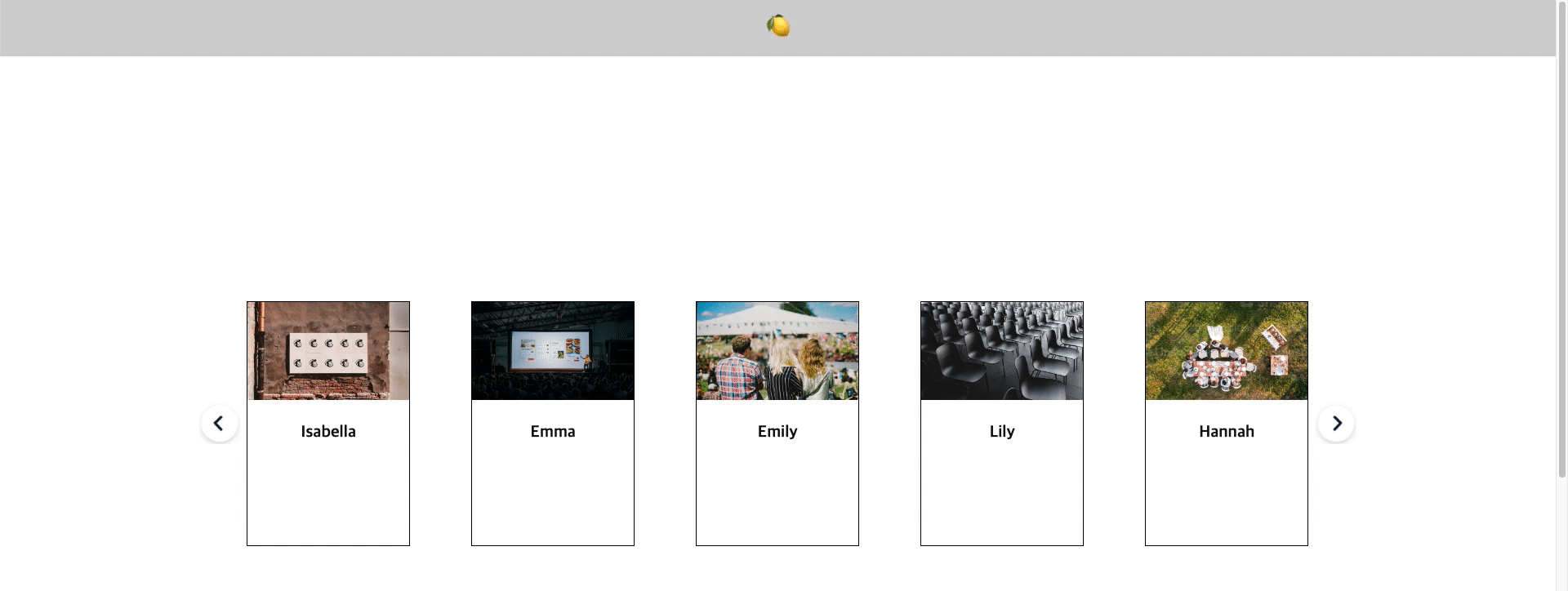
Preview
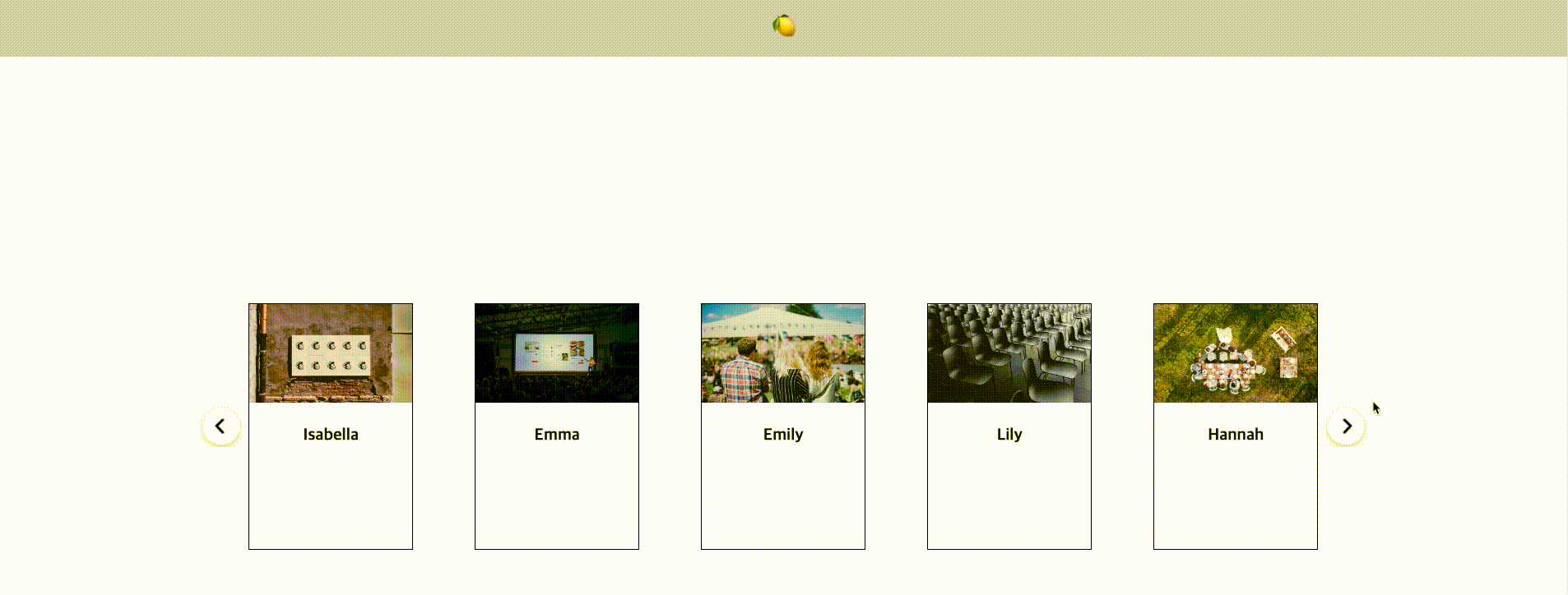
카드 형식의 컴포넌트들을 swiper를 사용해 슬라이드 형식으로 구현하였고 반응형을 적용하였습니다. Swiper 라이브러리에 관한 기본적인 설명은 아래 글을 참고하여 주세요.
https://3d-yeju.tistory.com/86
React | Swiper.js를 사용하여 이미지 슬라이드 구현하기
Preview swiper 기본 세팅 및 무한 루프 기능 swiper.js 설치 npm i swiper --save 서버에서 받아오는 데이터 처럼 .json 형태의 파일을 fetch로 가져와 slide를 map으로 돌리려 합니다. // swiper_event.json { "data": [ { "i
3d-yeju.tistory.com
카드 슬라이드
서버에서 받아오는 데이터처럼. json 형태의 파일을 fetch로 가져와 slide를 map으로 돌리려 합니다.
// swiper_card.json

{
  "data": [
    {
      "name": "Isabella",
      "img": "https://images.unsplash.com/photo-1661956603025-8310b2e3036d?ixlib=rb-4.0.3&ixid=MnwxMjA3fDF8MHxwaG90by1wYWdlfHx8fGVufDB8fHx8&auto=format&fit=crop&w=1170&q=80"
    },
    {
      "name": "Emma",
      "img": "https://images.unsplash.com/photo-1505373877841-8d25f7d46678?ixlib=rb-4.0.3&ixid=MnwxMjA3fDB8MHxwaG90by1wYWdlfHx8fGVufDB8fHx8&auto=format&fit=crop&w=1112&q=80"
    },
    {
      "name": "Emily",
      "img": "https://images.unsplash.com/photo-1472653431158-6364773b2a56?ixlib=rb-4.0.3&ixid=MnwxMjA3fDB8MHxwaG90by1wYWdlfHx8fGVufDB8fHx8&auto=format&fit=crop&w=1169&q=80"
    },
    {
      "name": "Lily",
      "img": "https://images.unsplash.com/photo-1507878866276-a947ef722fee?ixlib=rb-4.0.3&ixid=MnwxMjA3fDB8MHxwaG90by1wYWdlfHx8fGVufDB8fHx8&auto=format&fit=crop&w=1171&q=80"
    },
    {
      "name": "Hannah",
      "img": "https://plus.unsplash.com/premium_photo-1663100894140-930cf3ff227e?ixlib=rb-4.0.3&ixid=MnwxMjA3fDB8MHxwaG90by1wYWdlfHx8fGVufDB8fHx8&auto=format&fit=crop&w=1225&q=80"
    },
    {
      "name": "Zoe",
      "img": "https://images.unsplash.com/photo-1661956603025-8310b2e3036d?ixlib=rb-4.0.3&ixid=MnwxMjA3fDF8MHxwaG90by1wYWdlfHx8fGVufDB8fHx8&auto=format&fit=crop&w=1170&q=80"
    },
    {
      "name": "Claire",
      "img": "https://images.unsplash.com/photo-1505373877841-8d25f7d46678?ixlib=rb-4.0.3&ixid=MnwxMjA3fDB8MHxwaG90by1wYWdlfHx8fGVufDB8fHx8&auto=format&fit=crop&w=1112&q=80"
    },
    {
      "name": "Anna",
      "img": "https://images.unsplash.com/photo-1472653431158-6364773b2a56?ixlib=rb-4.0.3&ixid=MnwxMjA3fDB8MHxwaG90by1wYWdlfHx8fGVufDB8fHx8&auto=format&fit=crop&w=1169&q=80",
      "url": ""
    },
    {
      "name": "Kennedy",
      "img": "https://images.unsplash.com/photo-1507878866276-a947ef722fee?ixlib=rb-4.0.3&ixid=MnwxMjA3fDB8MHxwaG90by1wYWdlfHx8fGVufDB8fHx8&auto=format&fit=crop&w=1171&q=80"
    },
    {
      "name": "Madelyn",
      "img": "https://plus.unsplash.com/premium_photo-1663100894140-930cf3ff227e?ixlib=rb-4.0.3&ixid=MnwxMjA3fDB8MHxwaG90by1wYWdlfHx8fGVufDB8fHx8&auto=format&fit=crop&w=1225&q=80"
    }
  ]
}
// SwiperCard.tsx
import React, { useEffect, useRef, useState } from 'react';
import styled from 'styled-components';
import { Swiper, SwiperSlide } from 'swiper/react';
import SwiperCore from 'swiper';
import 'swiper/css';
interface Type_SwiperCard {
name: string;
img: string;
}
export default function SwiperCard() {
const swiperRef = useRef<SwiperCore>();
const [swiperList, setSwiperList] = useState<Type_SwiperCard[]>([]);
useEffect(() => {
fetch(`/data/swiper/swiper_card.json`)
.then(res => res.json())
.then(res => {
setSwiperList(res.data);
});
}, []);
return (
<Wrapper>
{swiperList && swiperList.length > 0 ? (
<>
<Swiper
onBeforeInit={swiper => {
swiperRef.current = swiper;
}}
slidesPerView={1}
breakpoints={{
800: {
slidesPerView: 2,
},
1200: {
slidesPerView: 3,
},
1600: {
slidesPerView: 4,
},
1920: {
slidesPerView: 5,
},
}}
>
{swiperList.map((data: Type_SwiperCard, idx: number) => (
<SwiperSlide key={idx}>
<CardWrap>
<img src={data.img} alt="thumb" />
<p>{data.name}</p>
</CardWrap>
</SwiperSlide>
))}
</Swiper>
<PrevBtn type="button" onClick={() => swiperRef.current?.slidePrev()}>
Prev
</PrevBtn>
<NextBtn type="button" onClick={() => swiperRef.current?.slideNext()}>
Next
</NextBtn>
</>
) : null}
</Wrapper>
);
}
const Wrapper = styled.div`
position: relative;
.swiper-slide {
display: -webkit-box;
display: -ms-flexbox;
display: -webkit-flex;
display: flex;
-webkit-box-pack: center;
-ms-flex-pack: center;
-webkit-justify-content: center;
justify-content: center;
-webkit-box-align: center;
-ms-flex-align: center;
-webkit-align-items: center;
align-items: center;
}
`;
const CardWrap = styled.div`
display: flex;
flex-direction: column;
width: 200px;
height: 300px;
border: solid 1px black;
img {
height: 120px;
}
p {
display: flex;
justify-content: center;
margin-top: 30px;
font-size: 20px;
font-weight: bold;
}
`;
const NaviBtn = styled.button`
width: 50px;
height: 50px;
position: absolute;
font-size: 0;
z-index: 100;
top: 50%;
transform: translateY(-50%);
cursor: pointer !important;
`;
const PrevBtn = styled(NaviBtn)`
background: url(${'/images/arrow/card_prev.png'}) no-repeat 50% 30%;
left: -25px;
`;
const NextBtn = styled(NaviBtn)`
background: url(${'/images/arrow/card_next.png'}) no-repeat 50% 30%;
right: -25px;
`;1. swiper 관련 라이브러리를 import 해줍니다.
* swiper/css를 import 하지 않으면 세팅을 해줘도 보이지 않으니 꼭꼭 import 하기!
2. <Swiper> 세팅하기
Swiper 태그 안에 SwiperSlide를 넣어 내부에 전체 콘텐츠를 세팅을 해주면 되는데, 이 부분을 map으로 처리해줍니다.
3. useref를 사용하여 버튼 커스텀하기
📌 이전 / 다음 슬라이드 이동하는 함수
swiperRef.current?.slidePrev()
swiperRef.current?.slideNext()
4. 반응형 설정하기
swiper는 반응형을 설정해줄 수 있는 옵션을 제공합니다. 화면의 크기에 따라 보이는 콘텐츠의 개수를 조절해야 할 때 유용하게 사용할 수 있습니다.
<Swiper
        slidesPerView={1}
        breakpoints={{
              800: {
                slidesPerView: 2,
              },
              1200: {
                slidesPerView: 3,
              },
              1600: {
                slidesPerView: 4,
              },
              1920: {
                slidesPerView: 5,
              },
              }}
>
작은 사이즈 부터 큰 사이즈로 설정한다고 생각하면 편하게 작업할 수 있습니다. slidesPerView는 콘텐츠가 보이는 개수를 의미하며 기본은 1로 되어있고 사이즈를 정의한 후 800 사이즈 이상은 2개 콘텐츠가 보이게 설정한다는 식으로 설정하면 됩니다.
5. css 중앙에 맞게 수정하기
기본적으로는 왼쪽부터 세팅이 되는데 보여지는 콘텐츠가 가운데를 유지하고자 한다면, css를 추가해줍니다.
  .swiper-slide {
    display: -webkit-box;
    display: -ms-flexbox;
    display: -webkit-flex;
    display: flex;
    -webkit-box-pack: center;
    -ms-flex-pack: center;
    -webkit-justify-content: center;
    justify-content: center;
    -webkit-box-align: center;
    -ms-flex-align: center;
    -webkit-align-items: center;
    align-items: center;
  }
https://velog.io/@hsw7852/swiper-breakpoints-반응형을-위한
https://codesandbox.io/embed/030n28?file=/src/App.jsx&codemirror=1